Royal Manchester Children’s Hospital
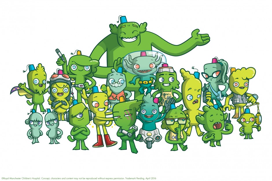
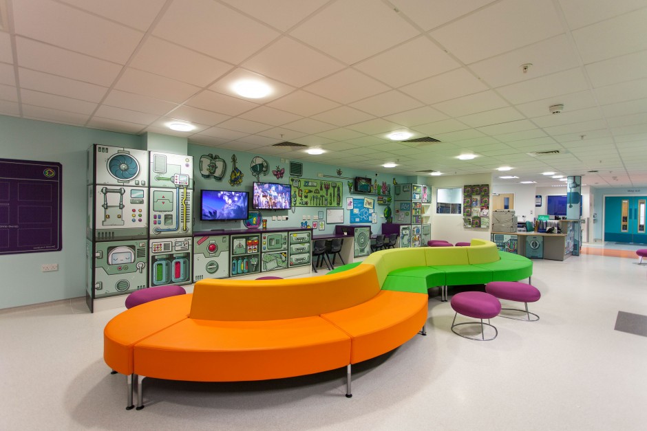
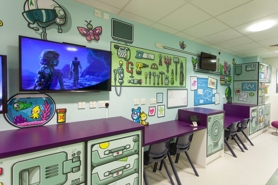
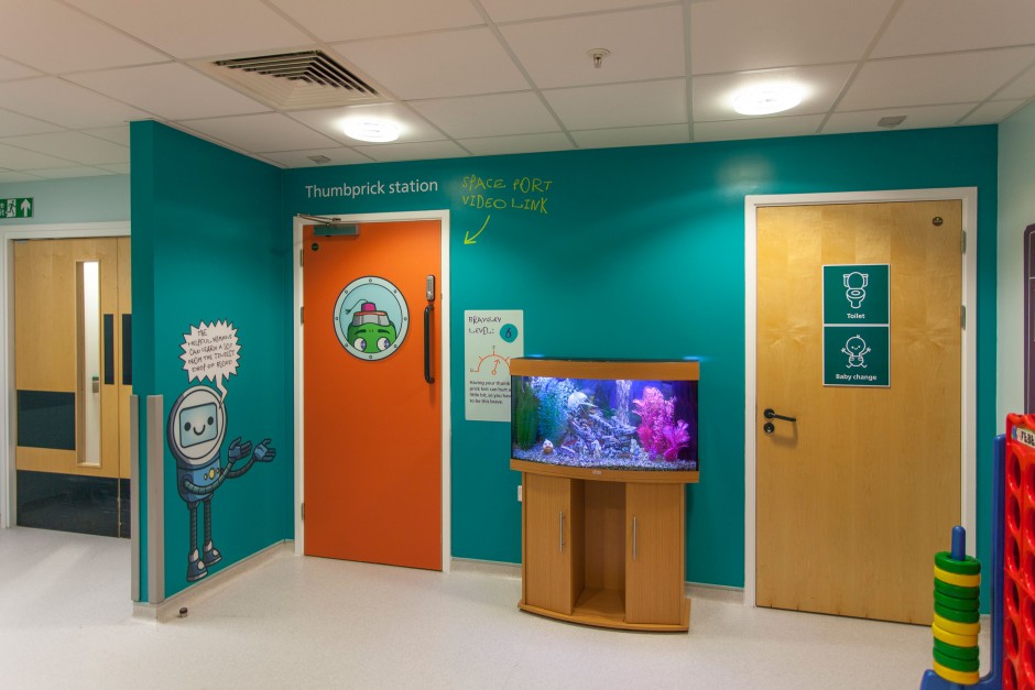
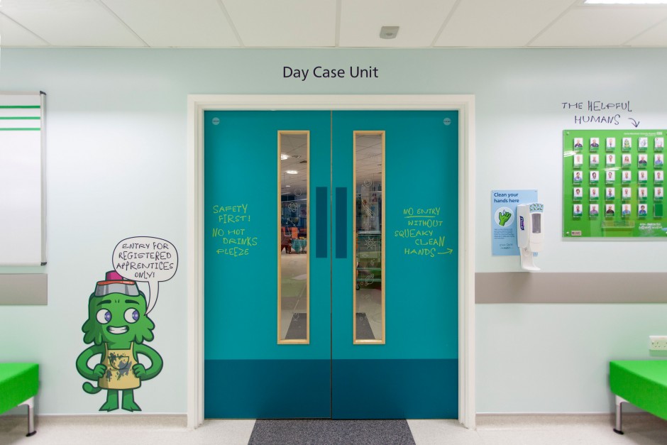
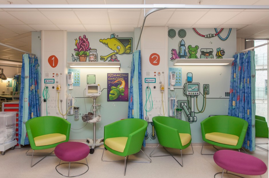
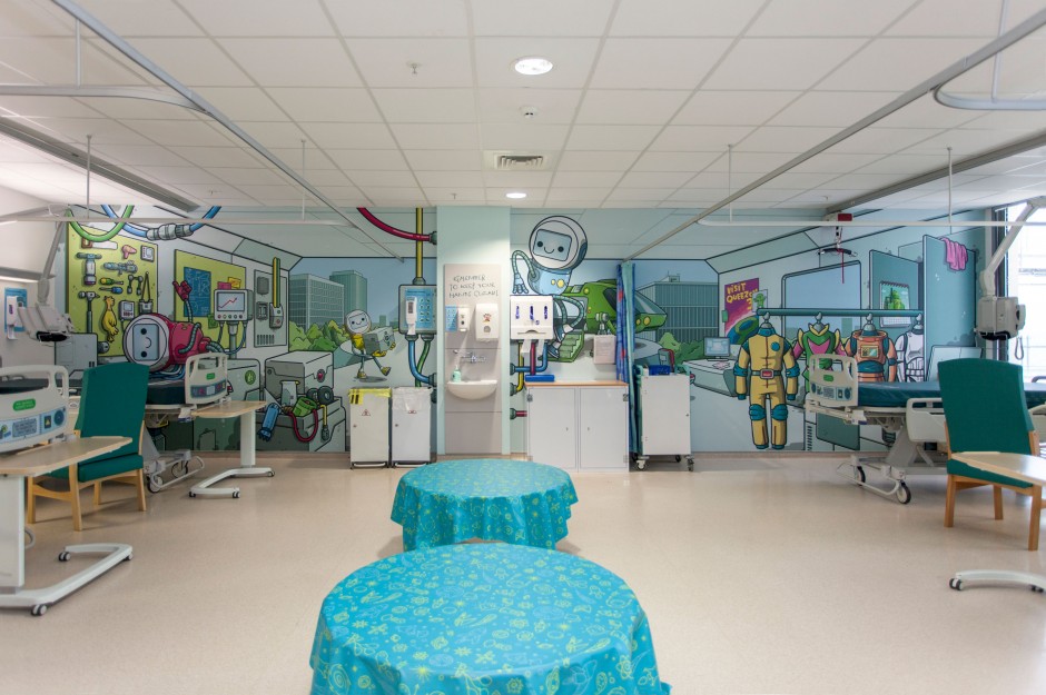
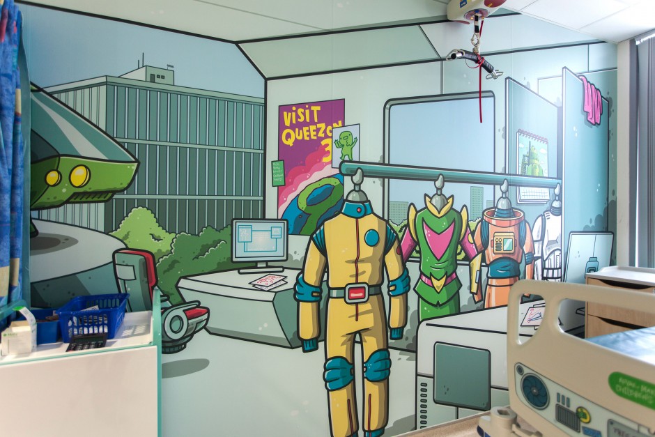
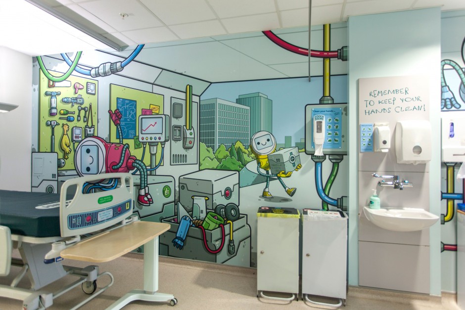
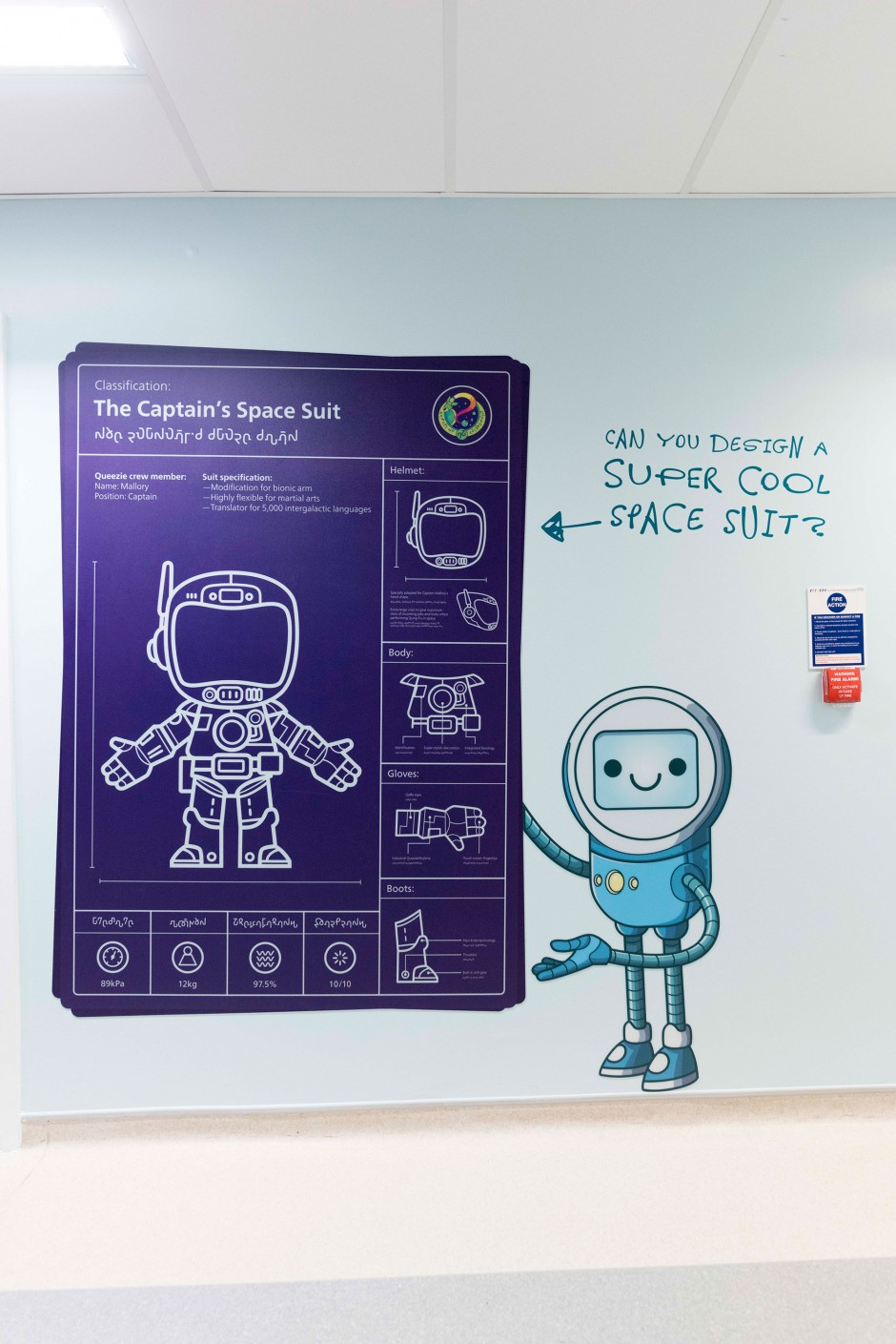
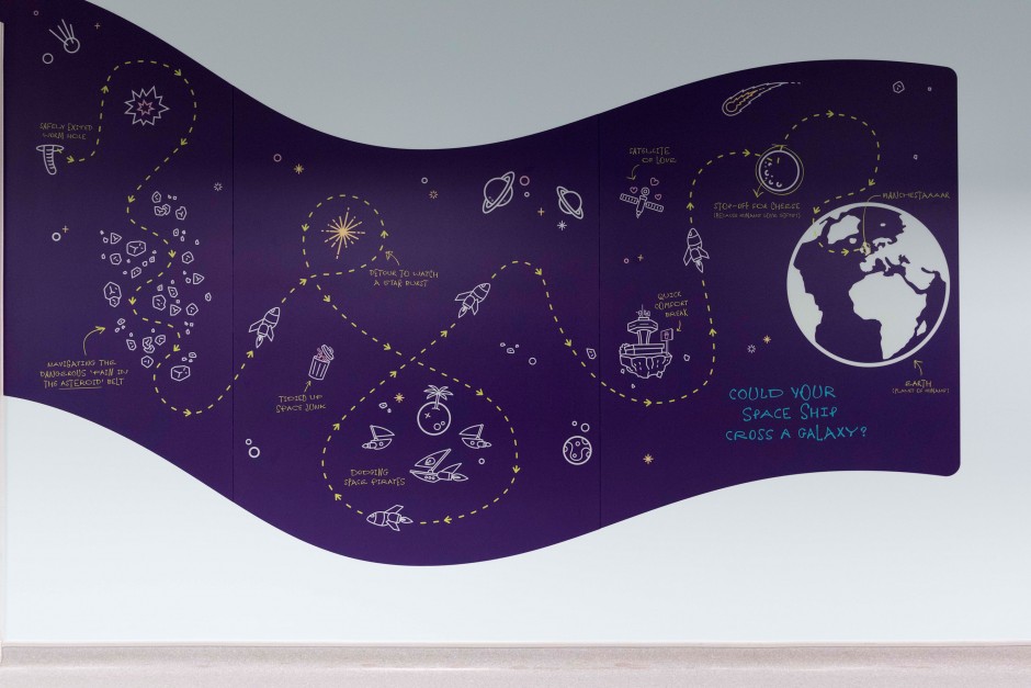
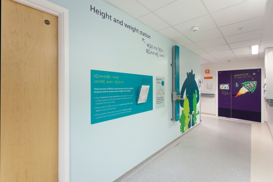
Since last year I’ve been working with the wonderful Hemisphere design and marketing consultancy to revamp the Royal Manchester Children’s Hospital to give it an exciting new identity, improve the wayfinding, add murals and games to occupy the patients, and to generally make it a nicer place to be. This is where The Queezies come in.
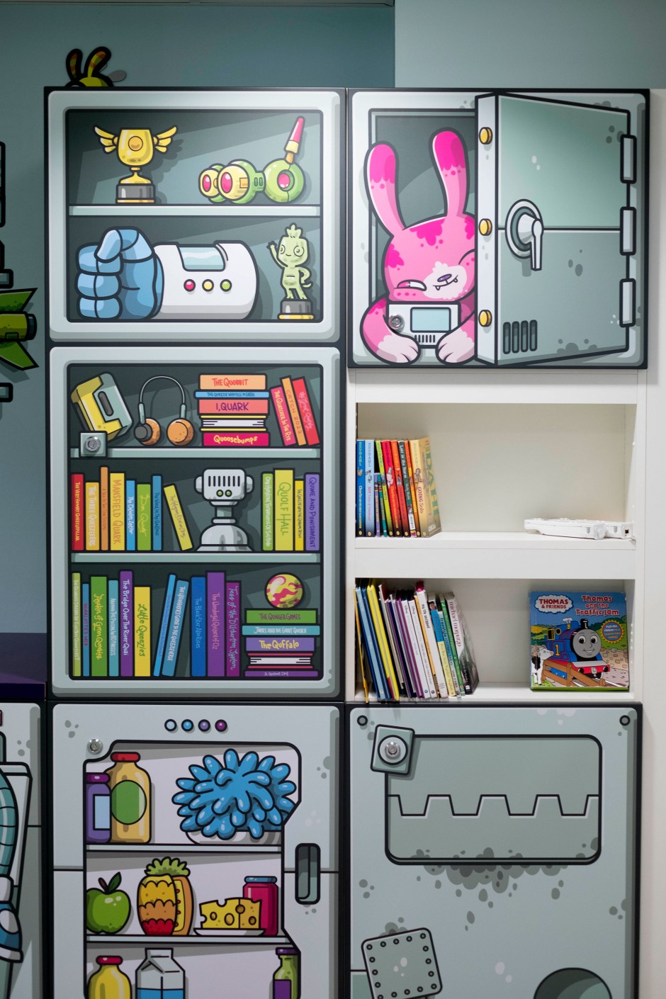
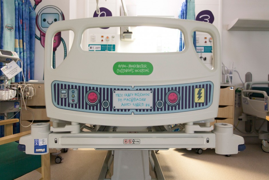
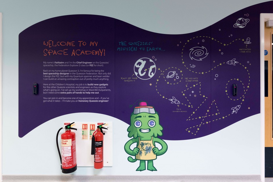
Named, and given a back story and character outlines by Stu the Copywriter, The Queezies are an alien race who have been sent to the best children’s hospital in the galaxy (RMCH, of course) to find a cure for a terrible disease which is affecting the young Queezies (or Queezlings) back on their home planet.
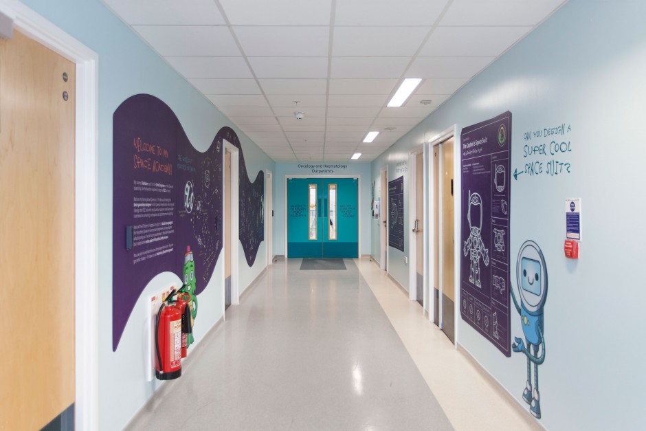
Typographer Jeremy Tankard was also brought in to create a bespoke Queezie font, which is being used as graffiti alongside some of the medical jargon to make it easier to understand. He’s written a really interesting piece about the creation of the font, which you can read here.
Also, Creative Review published an article on the whole project, which you can read here.
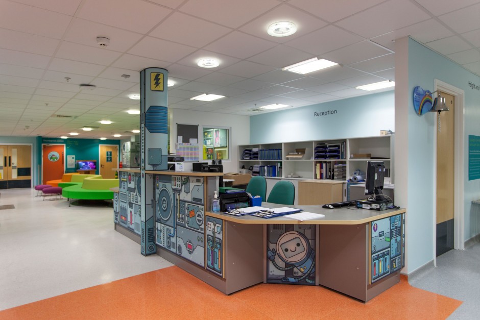
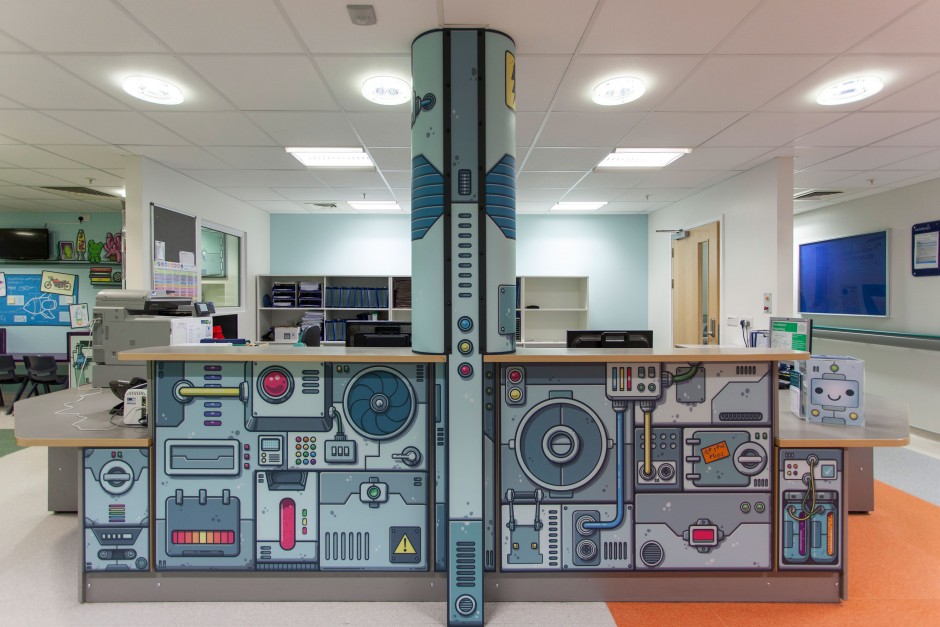
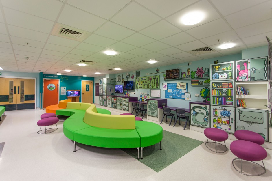
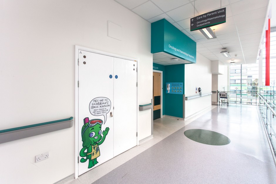
Ward 84 (Oncology and Haematology), which has been taken over by Fairbairn (a Queezie engineer), was recently completed (thanks in no small part to the funds raised by the Thomas Cook Children’s Charity), adding much needed storage, signage, excellent new furniture, and general all round queezification! Have a look…
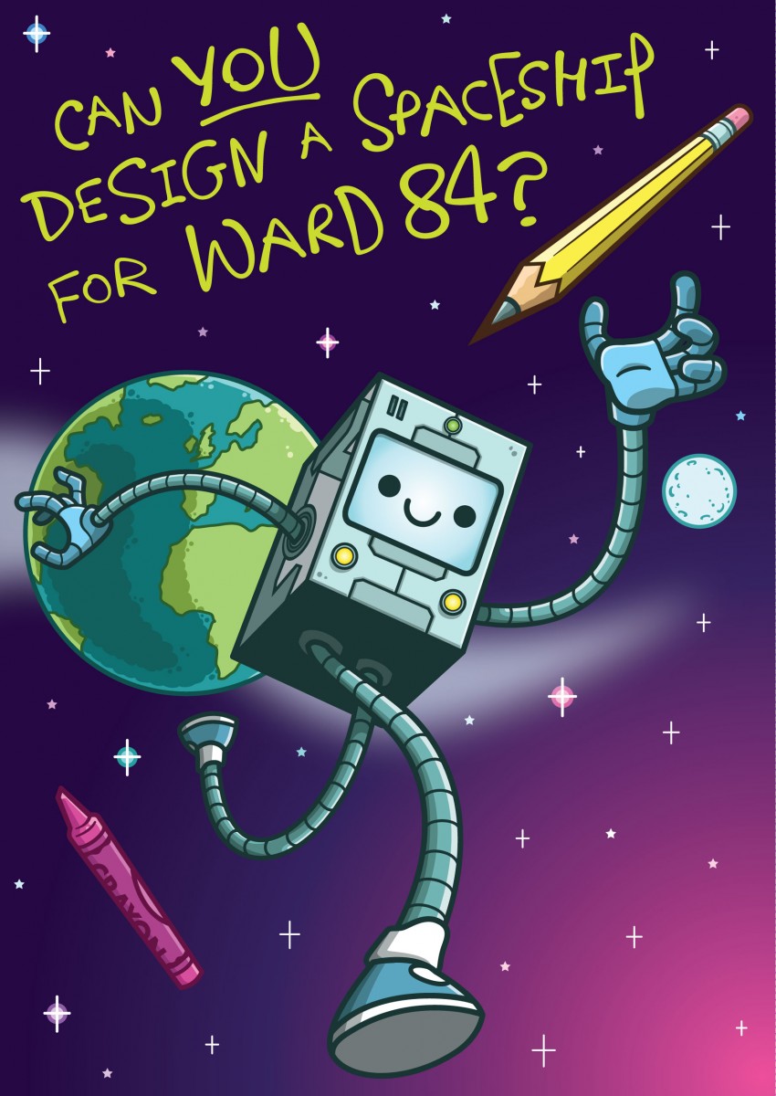
Design A Spaceship Competition
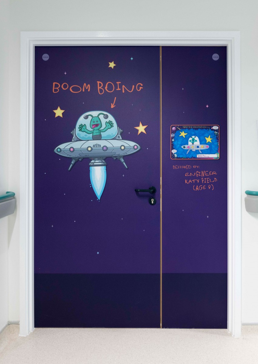
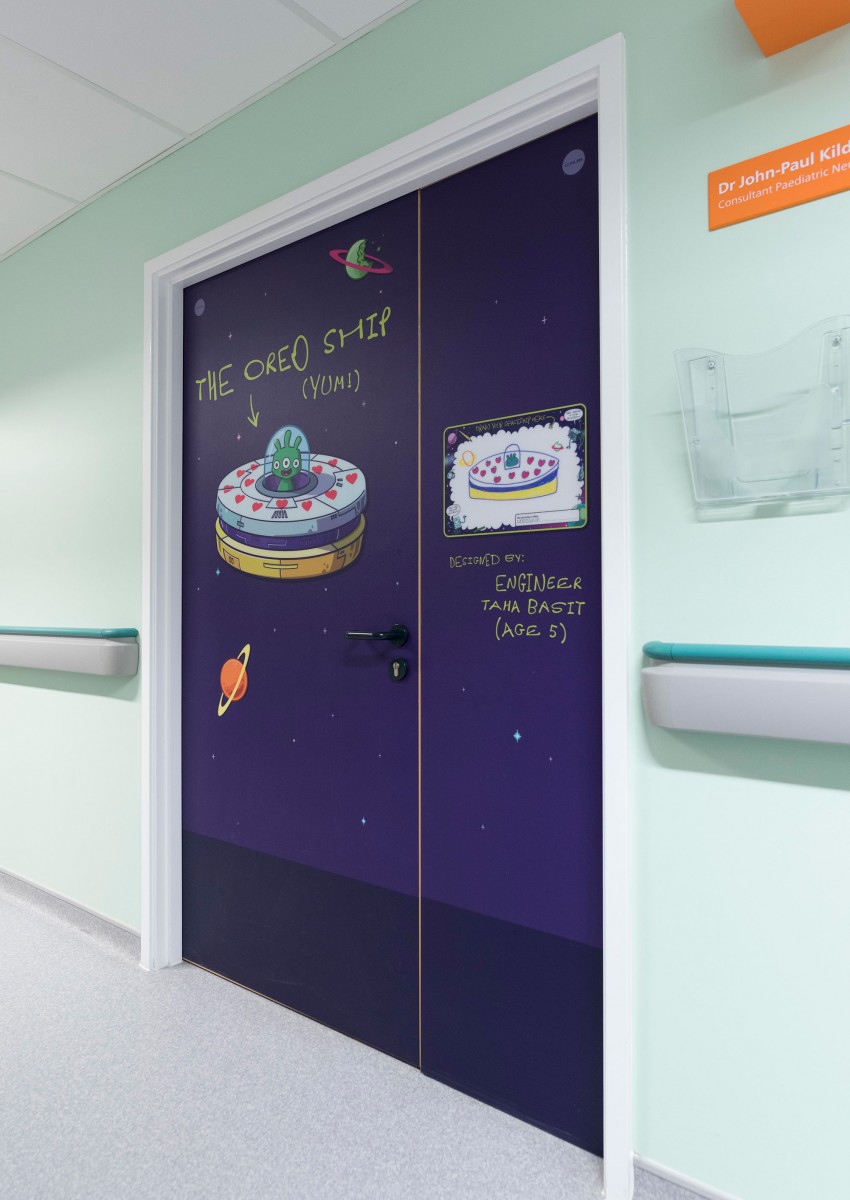
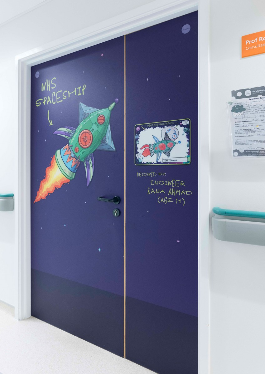
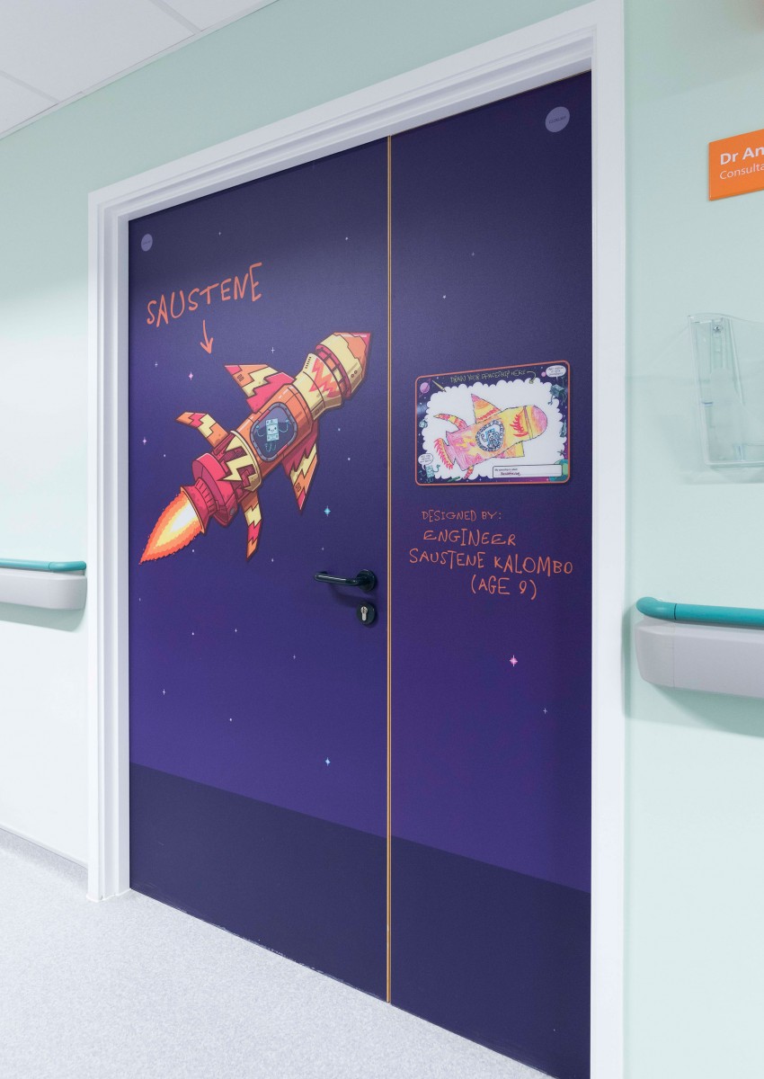
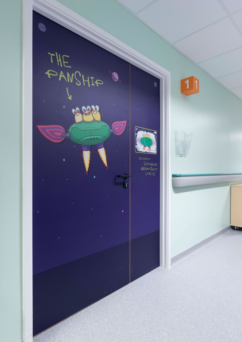
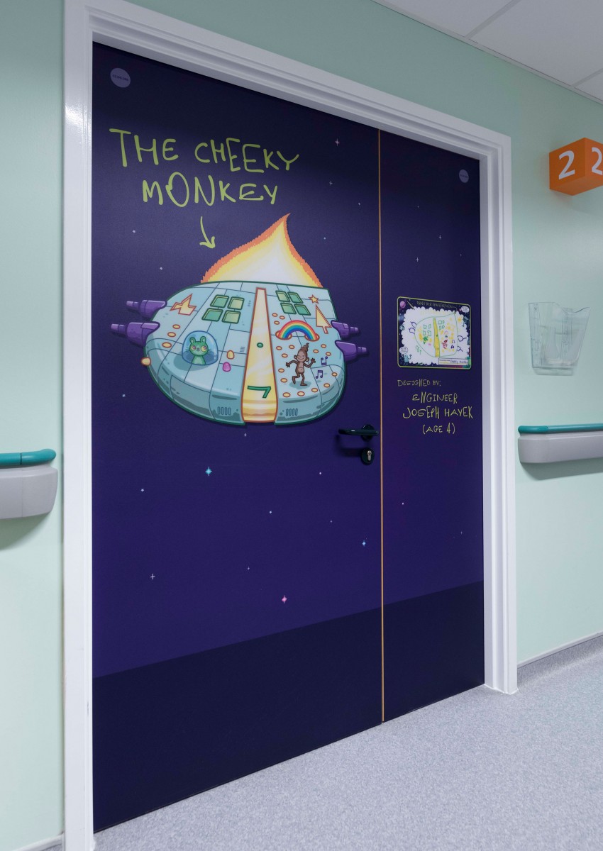
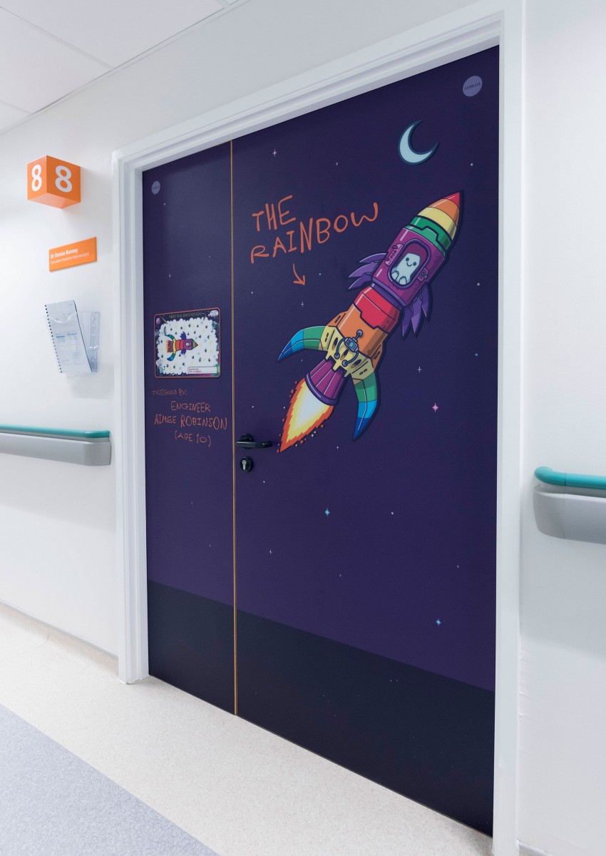
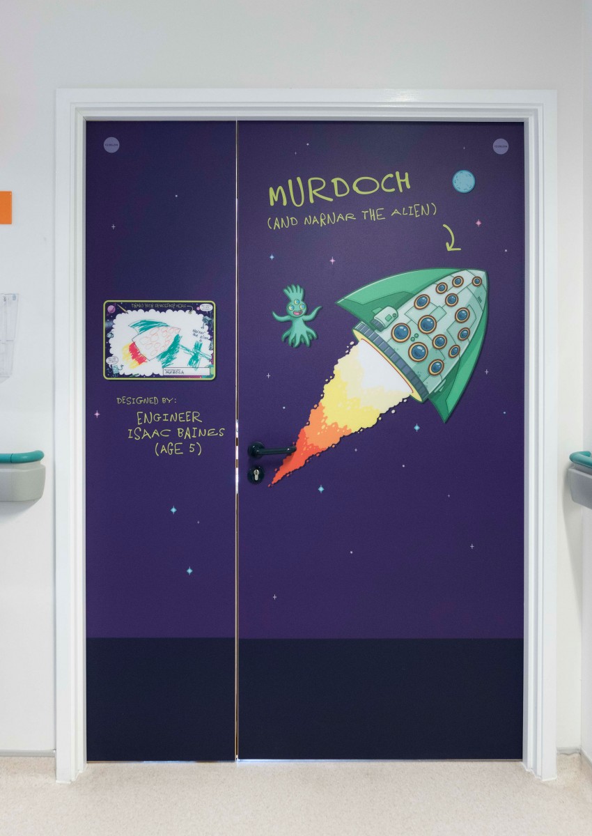
Patients at the hospital were invited to enter a competition to design their own spaceship. Each of the 9 fantastic winning designs now adorn the consultants’ doors, alongside slightly inferior versions drawn up by me…



 in <b>/home/thehammo/public_html/wp-content/themes/peak/includes/portfolio.php</b> on line <b>46</b><br />
http://www.thehammo.com/wp-content/uploads/2022/11/Sony-Thumb-440x440.jpg)
 in <b>/home/thehammo/public_html/wp-content/themes/peak/includes/portfolio.php</b> on line <b>46</b><br />
http://www.thehammo.com/wp-content/uploads/2022/11/IMG_FFCDA662C477-1-440x660.jpeg)
 in <b>/home/thehammo/public_html/wp-content/themes/peak/includes/portfolio.php</b> on line <b>46</b><br />
http://www.thehammo.com/wp-content/uploads/2022/11/Wet-The-Whistle-Mockup-E-440x391.jpg)
 in <b>/home/thehammo/public_html/wp-content/themes/peak/includes/portfolio.php</b> on line <b>46</b><br />
http://www.thehammo.com/wp-content/uploads/2021/05/wwTN-440x440.jpg)
 in <b>/home/thehammo/public_html/wp-content/themes/peak/includes/portfolio.php</b> on line <b>46</b><br />
http://www.thehammo.com/wp-content/uploads/2022/02/Arndale-Ocean-Thumb-440x440.jpg)
 in <b>/home/thehammo/public_html/wp-content/themes/peak/includes/portfolio.php</b> on line <b>46</b><br />
http://www.thehammo.com/wp-content/uploads/2022/02/Our-Manchester-Thumb-440x458.jpg)
 in <b>/home/thehammo/public_html/wp-content/themes/peak/includes/portfolio.php</b> on line <b>46</b><br />
http://www.thehammo.com/wp-content/uploads/2022/11/Birmingham-Girl-Thumb-440x490.jpg)
 in <b>/home/thehammo/public_html/wp-content/themes/peak/includes/portfolio.php</b> on line <b>46</b><br />
http://www.thehammo.com/wp-content/uploads/2021/05/CaneGrain-Thumb-440x441.jpg)
 in <b>/home/thehammo/public_html/wp-content/themes/peak/includes/portfolio.php</b> on line <b>46</b><br />
http://www.thehammo.com/wp-content/uploads/2022/02/NQ64-Thumb-440x440.jpg)
 in <b>/home/thehammo/public_html/wp-content/themes/peak/includes/portfolio.php</b> on line <b>46</b><br />
http://www.thehammo.com/wp-content/uploads/2022/11/Junkyard-5-thumb-440x409.jpg)
 in <b>/home/thehammo/public_html/wp-content/themes/peak/includes/portfolio.php</b> on line <b>46</b><br />
http://www.thehammo.com/wp-content/uploads/2021/01/Thumbnail-440x440.jpg)
 in <b>/home/thehammo/public_html/wp-content/themes/peak/includes/portfolio.php</b> on line <b>46</b><br />
http://www.thehammo.com/wp-content/uploads/2020/10/Seekers-thumb-440x440.png)
 in <b>/home/thehammo/public_html/wp-content/themes/peak/includes/portfolio.php</b> on line <b>46</b><br />
http://www.thehammo.com/wp-content/uploads/2021/05/Mercer-Thumb-440x440.jpg)
 in <b>/home/thehammo/public_html/wp-content/themes/peak/includes/portfolio.php</b> on line <b>46</b><br />
http://www.thehammo.com/wp-content/uploads/2020/11/Crazy-Pedros-Nightmare-Before-Christmas-lockdown-graffiti-mural-street-art-hammo-thehammo-Thumbnail-03-440x166.jpg)
 in <b>/home/thehammo/public_html/wp-content/themes/peak/includes/portfolio.php</b> on line <b>46</b><br />
http://www.thehammo.com/wp-content/uploads/2020/11/Bay-Horse-05-Andy-Burnham-Boris-Johnson-Eton-Mess-Hammo-thehammo-Manchester-Street-Art-440x532.jpg)
 in <b>/home/thehammo/public_html/wp-content/themes/peak/includes/portfolio.php</b> on line <b>46</b><br />
http://www.thehammo.com/wp-content/uploads/2020/11/WATD-alan-partridge-boris-johnson-lockdown-graffiti-mural-street-art-hammo-thehammo-03-440x288.jpg)
 in <b>/home/thehammo/public_html/wp-content/themes/peak/includes/portfolio.php</b> on line <b>46</b><br />
http://www.thehammo.com/wp-content/uploads/2020/10/Explorer-Thumb-440x413.jpg)
 in <b>/home/thehammo/public_html/wp-content/themes/peak/includes/portfolio.php</b> on line <b>46</b><br />
http://www.thehammo.com/wp-content/uploads/2020/10/Graverobber-Thumb-440x545.jpg)
 in <b>/home/thehammo/public_html/wp-content/themes/peak/includes/portfolio.php</b> on line <b>46</b><br />
http://www.thehammo.com/wp-content/uploads/2020/10/Southside-01-440x410.jpg)
 in <b>/home/thehammo/public_html/wp-content/themes/peak/includes/portfolio.php</b> on line <b>46</b><br />
http://www.thehammo.com/wp-content/uploads/2020/10/Liars-Thumb-440x359.jpg)
 in <b>/home/thehammo/public_html/wp-content/themes/peak/includes/portfolio.php</b> on line <b>46</b><br />
http://www.thehammo.com/wp-content/uploads/2020/10/BBB-Thumb-440x440.jpg)
 in <b>/home/thehammo/public_html/wp-content/themes/peak/includes/portfolio.php</b> on line <b>46</b><br />
http://www.thehammo.com/wp-content/uploads/2020/10/Morus-Thumb-440x440.jpg)
 in <b>/home/thehammo/public_html/wp-content/themes/peak/includes/portfolio.php</b> on line <b>46</b><br />
http://www.thehammo.com/wp-content/uploads/2020/06/MAF-Thumb.jpg)
 in <b>/home/thehammo/public_html/wp-content/themes/peak/includes/portfolio.php</b> on line <b>46</b><br />
http://www.thehammo.com/wp-content/uploads/2020/03/03a82e21-0f79-4fbd-8a7d-80f0fcb71ae5-440x330.jpg)
 in <b>/home/thehammo/public_html/wp-content/themes/peak/includes/portfolio.php</b> on line <b>46</b><br />
http://www.thehammo.com/wp-content/uploads/2020/03/EU-Gif-Small-440x440.gif)
 in <b>/home/thehammo/public_html/wp-content/themes/peak/includes/portfolio.php</b> on line <b>46</b><br />
http://www.thehammo.com/wp-content/uploads/2020/02/Hammo-Parkylife-Thumb-440x440.jpg)
 in <b>/home/thehammo/public_html/wp-content/themes/peak/includes/portfolio.php</b> on line <b>46</b><br />
http://www.thehammo.com/wp-content/uploads/2019/11/Grub-Thumb-440x422.jpg)
 in <b>/home/thehammo/public_html/wp-content/themes/peak/includes/portfolio.php</b> on line <b>46</b><br />
http://www.thehammo.com/wp-content/uploads/2019/01/Gorse-Hill-Thumbnail-440x440.png)
 in <b>/home/thehammo/public_html/wp-content/themes/peak/includes/portfolio.php</b> on line <b>46</b><br />
http://www.thehammo.com/wp-content/uploads/2019/11/David-Berman-Thumb-440x304.jpg)
 in <b>/home/thehammo/public_html/wp-content/themes/peak/includes/portfolio.php</b> on line <b>46</b><br />
http://www.thehammo.com/wp-content/uploads/2019/11/Nosferatu-Thumb-440x440.jpg)
 in <b>/home/thehammo/public_html/wp-content/themes/peak/includes/portfolio.php</b> on line <b>46</b><br />
http://www.thehammo.com/wp-content/uploads/2019/10/Piccadilly-East-Thumb-440x440.jpg)
 in <b>/home/thehammo/public_html/wp-content/themes/peak/includes/portfolio.php</b> on line <b>46</b><br />
http://www.thehammo.com/wp-content/uploads/2019/10/Norvic-House-BeesThumb-440x347.jpg)
 in <b>/home/thehammo/public_html/wp-content/themes/peak/includes/portfolio.php</b> on line <b>46</b><br />
http://www.thehammo.com/wp-content/uploads/2019/11/Marple-Hall-Thumb-440x630.jpg)
 in <b>/home/thehammo/public_html/wp-content/themes/peak/includes/portfolio.php</b> on line <b>46</b><br />
http://www.thehammo.com/wp-content/uploads/2019/07/Arndale-thumb-440x440.png)
 in <b>/home/thehammo/public_html/wp-content/themes/peak/includes/portfolio.php</b> on line <b>46</b><br />
http://www.thehammo.com/wp-content/uploads/2015/02/A-to-the-K-Thumbnail-440x440.jpg)
 in <b>/home/thehammo/public_html/wp-content/themes/peak/includes/portfolio.php</b> on line <b>46</b><br />
http://www.thehammo.com/wp-content/uploads/2019/07/JYJ-Thumb-440x428.jpg)
 in <b>/home/thehammo/public_html/wp-content/themes/peak/includes/portfolio.php</b> on line <b>46</b><br />
http://www.thehammo.com/wp-content/uploads/2019/07/CandG-Thumb-440x458.jpg)
 in <b>/home/thehammo/public_html/wp-content/themes/peak/includes/portfolio.php</b> on line <b>46</b><br />
http://www.thehammo.com/wp-content/uploads/2019/07/Morus-440x441.png)
 in <b>/home/thehammo/public_html/wp-content/themes/peak/includes/portfolio.php</b> on line <b>46</b><br />
http://www.thehammo.com/wp-content/uploads/2019/06/Kidlit-Mermaid-440x440.jpg)
 in <b>/home/thehammo/public_html/wp-content/themes/peak/includes/portfolio.php</b> on line <b>46</b><br />
http://www.thehammo.com/wp-content/uploads/2019/06/Mermaid-Thumb-440x440.jpg)
 in <b>/home/thehammo/public_html/wp-content/themes/peak/includes/portfolio.php</b> on line <b>46</b><br />
http://www.thehammo.com/wp-content/uploads/2019/05/Arndale-Thumb-440x440.jpg)
 in <b>/home/thehammo/public_html/wp-content/themes/peak/includes/portfolio.php</b> on line <b>46</b><br />
http://www.thehammo.com/wp-content/uploads/2019/04/Bears-Thumb-440x440.jpg)
 in <b>/home/thehammo/public_html/wp-content/themes/peak/includes/portfolio.php</b> on line <b>46</b><br />
http://www.thehammo.com/wp-content/uploads/2019/03/Selfridges-Thumb-440x440.jpg)
 in <b>/home/thehammo/public_html/wp-content/themes/peak/includes/portfolio.php</b> on line <b>46</b><br />
http://www.thehammo.com/wp-content/uploads/2019/03/JYJ-440x440.jpg)
 in <b>/home/thehammo/public_html/wp-content/themes/peak/includes/portfolio.php</b> on line <b>46</b><br />
http://www.thehammo.com/wp-content/uploads/2019/04/Welcome-Thumb-440x440.png)
 in <b>/home/thehammo/public_html/wp-content/themes/peak/includes/portfolio.php</b> on line <b>46</b><br />
http://www.thehammo.com/wp-content/uploads/2019/02/Parklife-Fresh-Bites-440x191.jpg)
 in <b>/home/thehammo/public_html/wp-content/themes/peak/includes/portfolio.php</b> on line <b>46</b><br />
http://www.thehammo.com/wp-content/uploads/2019/01/Cats-Thumbnail.jpg)
 in <b>/home/thehammo/public_html/wp-content/themes/peak/includes/portfolio.php</b> on line <b>46</b><br />
http://www.thehammo.com/wp-content/uploads/2019/01/NFM-Thumbnail-440x440.jpg)
 in <b>/home/thehammo/public_html/wp-content/themes/peak/includes/portfolio.php</b> on line <b>46</b><br />
http://www.thehammo.com/wp-content/uploads/2019/01/GRUB-Thumbnail-440x440.png)
 in <b>/home/thehammo/public_html/wp-content/themes/peak/includes/portfolio.php</b> on line <b>46</b><br />
http://www.thehammo.com/wp-content/uploads/2019/01/Snowman-thumbnail-440x440.png)
 in <b>/home/thehammo/public_html/wp-content/themes/peak/includes/portfolio.php</b> on line <b>46</b><br />
http://www.thehammo.com/wp-content/uploads/2018/09/IMG_1787-440x440.jpg)
 in <b>/home/thehammo/public_html/wp-content/themes/peak/includes/portfolio.php</b> on line <b>46</b><br />
http://www.thehammo.com/wp-content/uploads/2018/09/IMG_1480-440x622.jpg)
 in <b>/home/thehammo/public_html/wp-content/themes/peak/includes/portfolio.php</b> on line <b>46</b><br />
http://www.thehammo.com/wp-content/uploads/2018/09/IMG_1859-440x440.jpg)
 in <b>/home/thehammo/public_html/wp-content/themes/peak/includes/portfolio.php</b> on line <b>46</b><br />
http://www.thehammo.com/wp-content/uploads/2018/09/MBW-Hammo-Riso-Preview-440x622.jpg)
 in <b>/home/thehammo/public_html/wp-content/themes/peak/includes/portfolio.php</b> on line <b>46</b><br />
http://www.thehammo.com/wp-content/uploads/2018/06/Outhouse-Bee-Crop-440x491.jpg)
 in <b>/home/thehammo/public_html/wp-content/themes/peak/includes/portfolio.php</b> on line <b>46</b><br />
http://www.thehammo.com/wp-content/uploads/2019/01/Thumbnail-440x439.png)
 in <b>/home/thehammo/public_html/wp-content/themes/peak/includes/portfolio.php</b> on line <b>46</b><br />
http://www.thehammo.com/wp-content/uploads/2018/05/Adyen-Thumbnail-440x440.jpg)
 in <b>/home/thehammo/public_html/wp-content/themes/peak/includes/portfolio.php</b> on line <b>46</b><br />
http://www.thehammo.com/wp-content/uploads/2018/04/Tetsuo-Arm-440x440.png)
 in <b>/home/thehammo/public_html/wp-content/themes/peak/includes/portfolio.php</b> on line <b>46</b><br />
http://www.thehammo.com/wp-content/uploads/2018/09/IMG_0032-440x330.jpg)
 in <b>/home/thehammo/public_html/wp-content/themes/peak/includes/portfolio.php</b> on line <b>46</b><br />
http://www.thehammo.com/wp-content/uploads/2018/03/Assembly-440x440.jpg)
 in <b>/home/thehammo/public_html/wp-content/themes/peak/includes/portfolio.php</b> on line <b>46</b><br />
http://www.thehammo.com/wp-content/uploads/2017/11/Scott-Chegg-440x518.jpg)
 in <b>/home/thehammo/public_html/wp-content/themes/peak/includes/portfolio.php</b> on line <b>46</b><br />
http://www.thehammo.com/wp-content/uploads/2017/10/IMG_0694-1-440x440.jpg)
 in <b>/home/thehammo/public_html/wp-content/themes/peak/includes/portfolio.php</b> on line <b>46</b><br />
http://www.thehammo.com/wp-content/uploads/2017/06/Freds-Shutter-05-440x356.jpg)
 in <b>/home/thehammo/public_html/wp-content/themes/peak/includes/portfolio.php</b> on line <b>46</b><br />
http://www.thehammo.com/wp-content/uploads/2017/06/IMG_6828-440x440.jpg)
 in <b>/home/thehammo/public_html/wp-content/themes/peak/includes/portfolio.php</b> on line <b>46</b><br />
http://www.thehammo.com/wp-content/uploads/2017/06/IMG_6911-440x541.jpg)
 in <b>/home/thehammo/public_html/wp-content/themes/peak/includes/portfolio.php</b> on line <b>46</b><br />
http://www.thehammo.com/wp-content/uploads/2017/05/Google-Demo-Day-43-440x305.jpg)
 in <b>/home/thehammo/public_html/wp-content/themes/peak/includes/portfolio.php</b> on line <b>46</b><br />
http://www.thehammo.com/wp-content/uploads/2017/05/IMG_6663-440x440.jpg)
 in <b>/home/thehammo/public_html/wp-content/themes/peak/includes/portfolio.php</b> on line <b>46</b><br />
http://www.thehammo.com/wp-content/uploads/2017/05/IMG_6447-440x440.jpg)
 in <b>/home/thehammo/public_html/wp-content/themes/peak/includes/portfolio.php</b> on line <b>46</b><br />
http://www.thehammo.com/wp-content/uploads/2016/12/Substation-Thumb-440x440.jpg)
 in <b>/home/thehammo/public_html/wp-content/themes/peak/includes/portfolio.php</b> on line <b>46</b><br />
http://www.thehammo.com/wp-content/uploads/2016/04/Queezies-Group-shot-440x293.jpg)
 in <b>/home/thehammo/public_html/wp-content/themes/peak/includes/portfolio.php</b> on line <b>46</b><br />
http://www.thehammo.com/wp-content/uploads/2016/09/Wellington-Mill-Square-440x440.jpg)
 in <b>/home/thehammo/public_html/wp-content/themes/peak/includes/portfolio.php</b> on line <b>46</b><br />
http://www.thehammo.com/wp-content/uploads/2016/05/ABC10-440x440.jpg)
 in <b>/home/thehammo/public_html/wp-content/themes/peak/includes/portfolio.php</b> on line <b>46</b><br />
http://www.thehammo.com/wp-content/uploads/2016/05/IMG_1672-440x330.jpg)
 in <b>/home/thehammo/public_html/wp-content/themes/peak/includes/portfolio.php</b> on line <b>46</b><br />
http://www.thehammo.com/wp-content/uploads/2016/04/FA-Sketchbook-440x541.jpg)
 in <b>/home/thehammo/public_html/wp-content/themes/peak/includes/portfolio.php</b> on line <b>46</b><br />
http://www.thehammo.com/wp-content/uploads/2016/03/Garden-Visitors-440x440.jpg)
 in <b>/home/thehammo/public_html/wp-content/themes/peak/includes/portfolio.php</b> on line <b>46</b><br />
http://www.thehammo.com/wp-content/uploads/2016/03/Where-Are-We-Now-E-440x440.jpg)
 in <b>/home/thehammo/public_html/wp-content/themes/peak/includes/portfolio.php</b> on line <b>46</b><br />
http://www.thehammo.com/wp-content/uploads/2015/11/HOME-Robot-B-Large-440x455.jpg)
 in <b>/home/thehammo/public_html/wp-content/themes/peak/includes/portfolio.php</b> on line <b>46</b><br />
http://www.thehammo.com/wp-content/uploads/2015/10/McFly-2015-440x526.jpg)
 in <b>/home/thehammo/public_html/wp-content/themes/peak/includes/portfolio.php</b> on line <b>46</b><br />
http://www.thehammo.com/wp-content/uploads/2015/09/Final-Middle1-440x440.jpg)
 in <b>/home/thehammo/public_html/wp-content/themes/peak/includes/portfolio.php</b> on line <b>46</b><br />
http://www.thehammo.com/wp-content/uploads/2015/08/G-ShockFeature-440x453.jpg)
 in <b>/home/thehammo/public_html/wp-content/themes/peak/includes/portfolio.php</b> on line <b>46</b><br />
http://www.thehammo.com/wp-content/uploads/2015/02/A-Lennie-440x587.jpg)
 in <b>/home/thehammo/public_html/wp-content/themes/peak/includes/portfolio.php</b> on line <b>46</b><br />
http://www.thehammo.com/wp-content/uploads/2016/03/Dad-CBE-440x440.jpg)
 in <b>/home/thehammo/public_html/wp-content/themes/peak/includes/portfolio.php</b> on line <b>46</b><br />
http://www.thehammo.com/wp-content/uploads/2014/01/Koffee-Pot-2015-Thumb-440x342.jpg)
 in <b>/home/thehammo/public_html/wp-content/themes/peak/includes/portfolio.php</b> on line <b>46</b><br />
http://www.thehammo.com/wp-content/uploads/2015/04/NB06-440x440.jpg)
 in <b>/home/thehammo/public_html/wp-content/themes/peak/includes/portfolio.php</b> on line <b>46</b><br />
http://www.thehammo.com/wp-content/uploads/2015/03/Creative-Spark-ALL-STAFF-Thumb-440x440.jpg)
 in <b>/home/thehammo/public_html/wp-content/themes/peak/includes/portfolio.php</b> on line <b>46</b><br />
http://www.thehammo.com/wp-content/uploads/2014/12/Toasted-Xmas-Crop-2014-440x523.jpg)
 in <b>/home/thehammo/public_html/wp-content/themes/peak/includes/portfolio.php</b> on line <b>46</b><br />
http://www.thehammo.com/wp-content/uploads/2014/08/Phone-front-440x290.png)
 in <b>/home/thehammo/public_html/wp-content/themes/peak/includes/portfolio.php</b> on line <b>46</b><br />
http://www.thehammo.com/wp-content/uploads/2014/08/GreggsBillboard04-440x498.jpg)
 in <b>/home/thehammo/public_html/wp-content/themes/peak/includes/portfolio.php</b> on line <b>46</b><br />
http://www.thehammo.com/wp-content/uploads/2014/08/Mork-Insta-440x440.jpg)
 in <b>/home/thehammo/public_html/wp-content/themes/peak/includes/portfolio.php</b> on line <b>46</b><br />
http://www.thehammo.com/wp-content/uploads/2014/07/Break-Featured-Image-440x602.jpg)
 in <b>/home/thehammo/public_html/wp-content/themes/peak/includes/portfolio.php</b> on line <b>46</b><br />
http://www.thehammo.com/wp-content/uploads/2014/01/jakes04-440x330.jpg)
 in <b>/home/thehammo/public_html/wp-content/themes/peak/includes/portfolio.php</b> on line <b>46</b><br />
http://www.thehammo.com/wp-content/uploads/2014/06/Fridge-Magneto-Crop-440x463.jpg)
 in <b>/home/thehammo/public_html/wp-content/themes/peak/includes/portfolio.php</b> on line <b>46</b><br />
http://www.thehammo.com/wp-content/uploads/2014/04/San-Fran-440x587.jpg)
 in <b>/home/thehammo/public_html/wp-content/themes/peak/includes/portfolio.php</b> on line <b>46</b><br />
http://www.thehammo.com/wp-content/uploads/2013/01/01-DrawCoenBros2-440x563.jpg)
 in <b>/home/thehammo/public_html/wp-content/themes/peak/includes/portfolio.php</b> on line <b>46</b><br />
http://www.thehammo.com/wp-content/uploads/2014/01/02-TW03-02-440x440.jpg)
 in <b>/home/thehammo/public_html/wp-content/themes/peak/includes/portfolio.php</b> on line <b>46</b><br />
http://www.thehammo.com/wp-content/uploads/2014/01/07-Arup-characters-02-440x231.jpg)
 in <b>/home/thehammo/public_html/wp-content/themes/peak/includes/portfolio.php</b> on line <b>46</b><br />
http://www.thehammo.com/wp-content/uploads/2014/01/05-JDc-Window-02-02-440x587.jpg)
 in <b>/home/thehammo/public_html/wp-content/themes/peak/includes/portfolio.php</b> on line <b>46</b><br />
http://www.thehammo.com/wp-content/uploads/2014/01/04-Oh-Heck-21-440x622.jpg)
 in <b>/home/thehammo/public_html/wp-content/themes/peak/includes/portfolio.php</b> on line <b>46</b><br />
http://www.thehammo.com/wp-content/uploads/2014/01/Service-Airport1-440x313.jpg)
 in <b>/home/thehammo/public_html/wp-content/themes/peak/includes/portfolio.php</b> on line <b>46</b><br />
http://www.thehammo.com/wp-content/uploads/2014/01/03-Future-Santa-A-Large1-440x622.jpg)
 in <b>/home/thehammo/public_html/wp-content/themes/peak/includes/portfolio.php</b> on line <b>46</b><br />
http://www.thehammo.com/wp-content/uploads/2013/01/Manc-Map-Extra-21-440x467.jpg)
 in <b>/home/thehammo/public_html/wp-content/themes/peak/includes/portfolio.php</b> on line <b>46</b><br />
http://www.thehammo.com/wp-content/uploads/2013/05/12-Kosmonaut-04-440x551.jpg)
 in <b>/home/thehammo/public_html/wp-content/themes/peak/includes/portfolio.php</b> on line <b>46</b><br />
http://www.thehammo.com/wp-content/uploads/2014/01/13-Dads-Going-to-Kill-You-BluePink1-440x622.jpg)
 in <b>/home/thehammo/public_html/wp-content/themes/peak/includes/portfolio.php</b> on line <b>46</b><br />
http://www.thehammo.com/wp-content/uploads/2014/01/07-Hepworth-A-Oddball-1-440x619.jpg)
 in <b>/home/thehammo/public_html/wp-content/themes/peak/includes/portfolio.php</b> on line <b>46</b><br />
http://www.thehammo.com/wp-content/uploads/2014/01/vidic1-440x623.jpg)
 in <b>/home/thehammo/public_html/wp-content/themes/peak/includes/portfolio.php</b> on line <b>46</b><br />
http://www.thehammo.com/wp-content/uploads/2014/01/06-Riot-Jazz1-440x440.jpg)
 in <b>/home/thehammo/public_html/wp-content/themes/peak/includes/portfolio.php</b> on line <b>46</b><br />
http://www.thehammo.com/wp-content/uploads/2014/01/08-Samurai-Jack1-440x561.jpg)
 in <b>/home/thehammo/public_html/wp-content/themes/peak/includes/portfolio.php</b> on line <b>46</b><br />
http://www.thehammo.com/wp-content/uploads/2014/01/11-Cosmonaut021-440x622.jpg)
 in <b>/home/thehammo/public_html/wp-content/themes/peak/includes/portfolio.php</b> on line <b>46</b><br />
http://www.thehammo.com/wp-content/uploads/2014/01/Fresh-Bites-11-440x440.jpg)
 in <b>/home/thehammo/public_html/wp-content/themes/peak/includes/portfolio.php</b> on line <b>46</b><br />
http://www.thehammo.com/wp-content/uploads/2014/01/Fry1-440x605.jpg)
 in <b>/home/thehammo/public_html/wp-content/themes/peak/includes/portfolio.php</b> on line <b>46</b><br />
http://www.thehammo.com/wp-content/uploads/2014/01/07-Hepworth-Zombie-Walk1-440x623.jpg)
 in <b>/home/thehammo/public_html/wp-content/themes/peak/includes/portfolio.php</b> on line <b>46</b><br />
http://www.thehammo.com/wp-content/uploads/2014/05/Ygritte-440x552.jpg)
 in <b>/home/thehammo/public_html/wp-content/themes/peak/includes/portfolio.php</b> on line <b>46</b><br />
http://www.thehammo.com/wp-content/uploads/2014/01/Hodor1-440x552.jpg)
 in <b>/home/thehammo/public_html/wp-content/themes/peak/includes/portfolio.php</b> on line <b>46</b><br />
http://www.thehammo.com/wp-content/uploads/2014/01/07-Hepworth-Jubilee1-440x622.jpg)
 in <b>/home/thehammo/public_html/wp-content/themes/peak/includes/portfolio.php</b> on line <b>46</b><br />
http://www.thehammo.com/wp-content/uploads/2014/01/Chewie1-440x437.jpg)
 in <b>/home/thehammo/public_html/wp-content/themes/peak/includes/portfolio.php</b> on line <b>46</b><br />
http://www.thehammo.com/wp-content/uploads/2014/01/Outhouse1-440x114.jpg)
 in <b>/home/thehammo/public_html/wp-content/themes/peak/includes/portfolio.php</b> on line <b>46</b><br />
http://www.thehammo.com/wp-content/uploads/2014/01/Marple-Mural-left1-440x589.jpg)
 in <b>/home/thehammo/public_html/wp-content/themes/peak/includes/portfolio.php</b> on line <b>46</b><br />
http://www.thehammo.com/wp-content/uploads/2014/01/14-Uncle-Jimmys-Sword1-440x592.jpg)
 in <b>/home/thehammo/public_html/wp-content/themes/peak/includes/portfolio.php</b> on line <b>46</b><br />
http://www.thehammo.com/wp-content/uploads/2014/01/Alex31-440x450.jpg)
 in <b>/home/thehammo/public_html/wp-content/themes/peak/includes/portfolio.php</b> on line <b>46</b><br />
http://www.thehammo.com/wp-content/uploads/2014/01/Badger21-440x550.jpg)
 in <b>/home/thehammo/public_html/wp-content/themes/peak/includes/portfolio.php</b> on line <b>46</b><br />
http://www.thehammo.com/wp-content/uploads/2014/01/Keith21-440x440.jpg)
 in <b>/home/thehammo/public_html/wp-content/themes/peak/includes/portfolio.php</b> on line <b>46</b><br />
http://www.thehammo.com/wp-content/uploads/2014/01/Lyric41-440x440.jpg)
 in <b>/home/thehammo/public_html/wp-content/themes/peak/includes/portfolio.php</b> on line <b>46</b><br />
http://www.thehammo.com/wp-content/uploads/2014/01/CS011-440x440.jpg)
 in <b>/home/thehammo/public_html/wp-content/themes/peak/includes/portfolio.php</b> on line <b>46</b><br />
http://www.thehammo.com/wp-content/uploads/2014/06/Playtime-440x308.jpg)
 in <b>/home/thehammo/public_html/wp-content/themes/peak/includes/portfolio.php</b> on line <b>46</b><br />
http://www.thehammo.com/wp-content/uploads/2014/06/Aftermath-440x312.jpg)
 in <b>/home/thehammo/public_html/wp-content/themes/peak/includes/portfolio.php</b> on line <b>46</b><br />
http://www.thehammo.com/wp-content/uploads/2014/06/Space-Cadets-440x623.jpg)
 in <b>/home/thehammo/public_html/wp-content/themes/peak/includes/portfolio.php</b> on line <b>46</b><br />
http://www.thehammo.com/wp-content/uploads/2014/06/Robosanta-2-440x620.jpg)
 in <b>/home/thehammo/public_html/wp-content/themes/peak/includes/portfolio.php</b> on line <b>46</b><br />
http://www.thehammo.com/wp-content/uploads/2014/06/NC-Pink-440x503.jpg)
 in <b>/home/thehammo/public_html/wp-content/themes/peak/includes/portfolio.php</b> on line <b>46</b><br />
http://www.thehammo.com/wp-content/uploads/2014/06/MAG-Tee-440x587.jpg)
 in <b>/home/thehammo/public_html/wp-content/themes/peak/includes/portfolio.php</b> on line <b>46</b><br />
http://www.thehammo.com/wp-content/uploads/2014/07/Daniel-440x611.jpg)